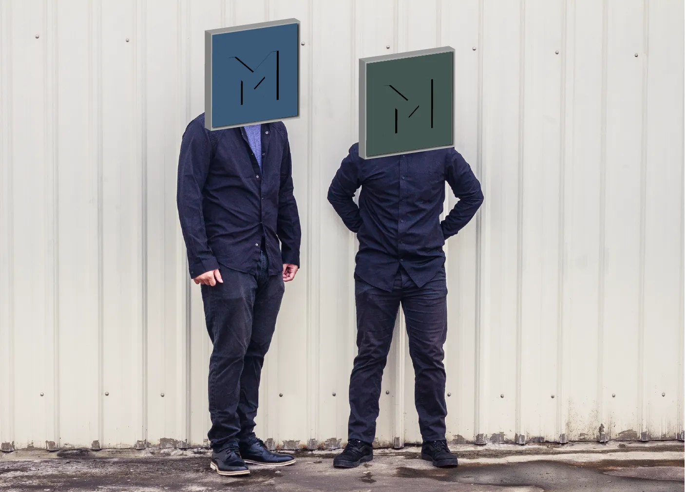
Minofmeer identity
A ten-year identity for a furniture and craft studio. Built to bend without breaking.
Brand identity for Minofmeer, a furniture and craft studio in Taiwan. Refined for ten years. Anyone in the studio can make on-brand work without a designer in the room.
Role
Co-founder and creative lead. Wrote the manifesto. Then I turned it into the brand system. The direction, the guidelines, every asset.
Team
Co-founder + product designer
The challenge
A new furniture and craft studio with no brand at all. Everything had to be defined from zero before it could face the world.
The approach
One idea drives everything: min vs meer , less versus more. Some projects need restraint, others need more. The identity bends to each project instead of forcing one look.
Minofmeer means "more or less" in Afrikaans, and the name is the philosophy: some projects need restraint, others need more. That balance decides every choice.
Color palette
Primary
#466A8C
Secondary
#4E655F
Tertiary
#543144
Typography
More or less
More or less
Identity development
A geometric cube mark on an isometric grid, readable from any angle. Type carrying English and Chinese.
Operational system
Templates and docs written for non-designers, so anyone can work on brand.
Website design
Numbered case studies, the same structure each time, no decoration for its own sake.
- Challenges1/2
A system that stretches from restrained to expressive without breaking.
- Insights2/2
If the guidelines need explaining, they are too complex.
Swipe to explore